My role: Lead design, Interaction Design, Prototyping
Team: Product manager, 3 Engineers, Business analyst, Design system lead
Duration: August 2023 to September 2024
Backgound
Coupa was seeing signs of customer dissatisfaction, not just through support tickets or complaints, but through real business losses. In several cases, including large enterprise customers like Disney, DHL... we noticed that even when Coupa helped save millions through sourcing optimization, the user experience within procurement remained a bottleneck, slowing down invoice cycles and affecting supplier enablement.
One clear signal came from internal performance metrics: Pending Buyer Action was consistently one of the longest wait states in the procurement lifecycle. Requisitions would sit idle for days, sometimes weeks, because buyers couldn’t tell which requests were theirs — or worse, teams would duplicate efforts or miss approvals altogether.
Requests were sitting idle because there was no clear ownership
• Missed SLAs for approvals
• Manual tracking
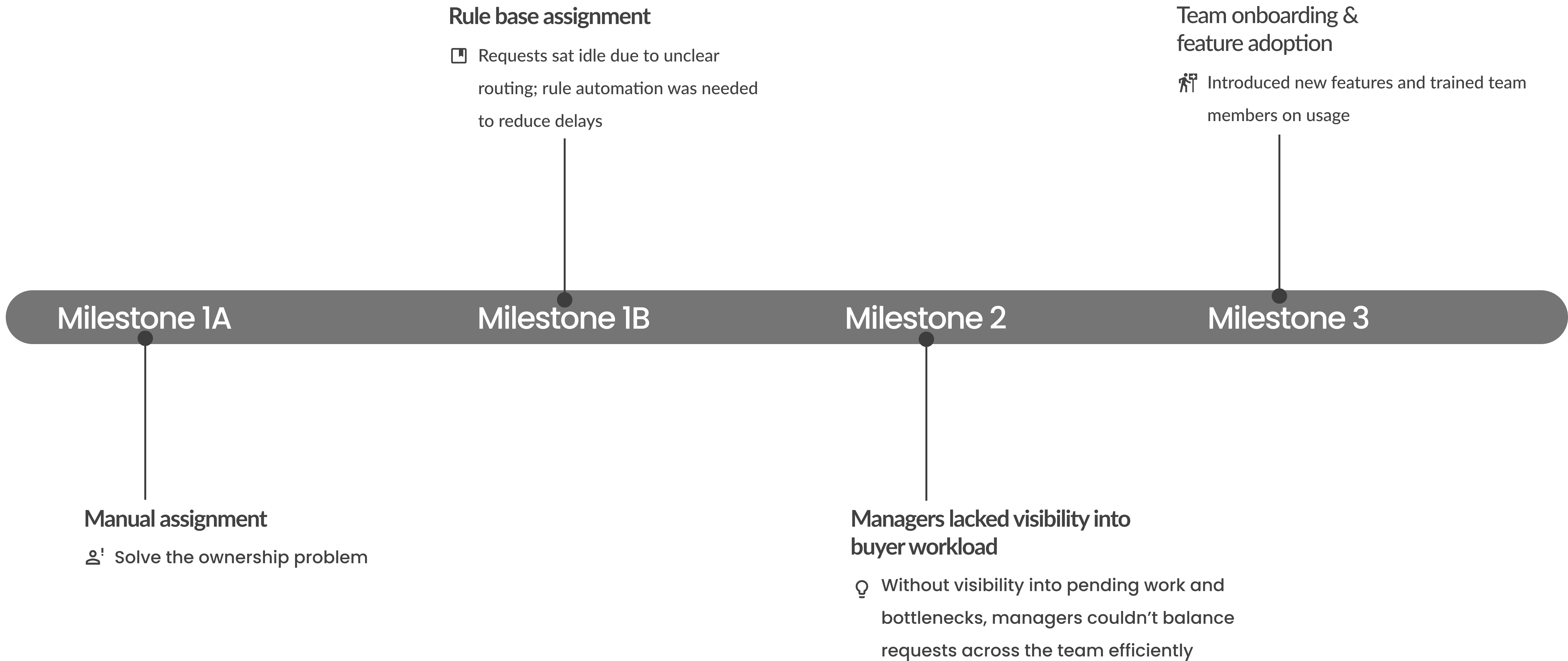
Rather than jumping straight into design, I stepped back to define a high-level strategy to tackle the root problem. I broke it down into three milestones, which were presented during the August 2023 walkthrough and targeted for completion by September 2024.
In the early stages of the project, I mapped out the existing requisition handling process and identified major workflow breakdowns.
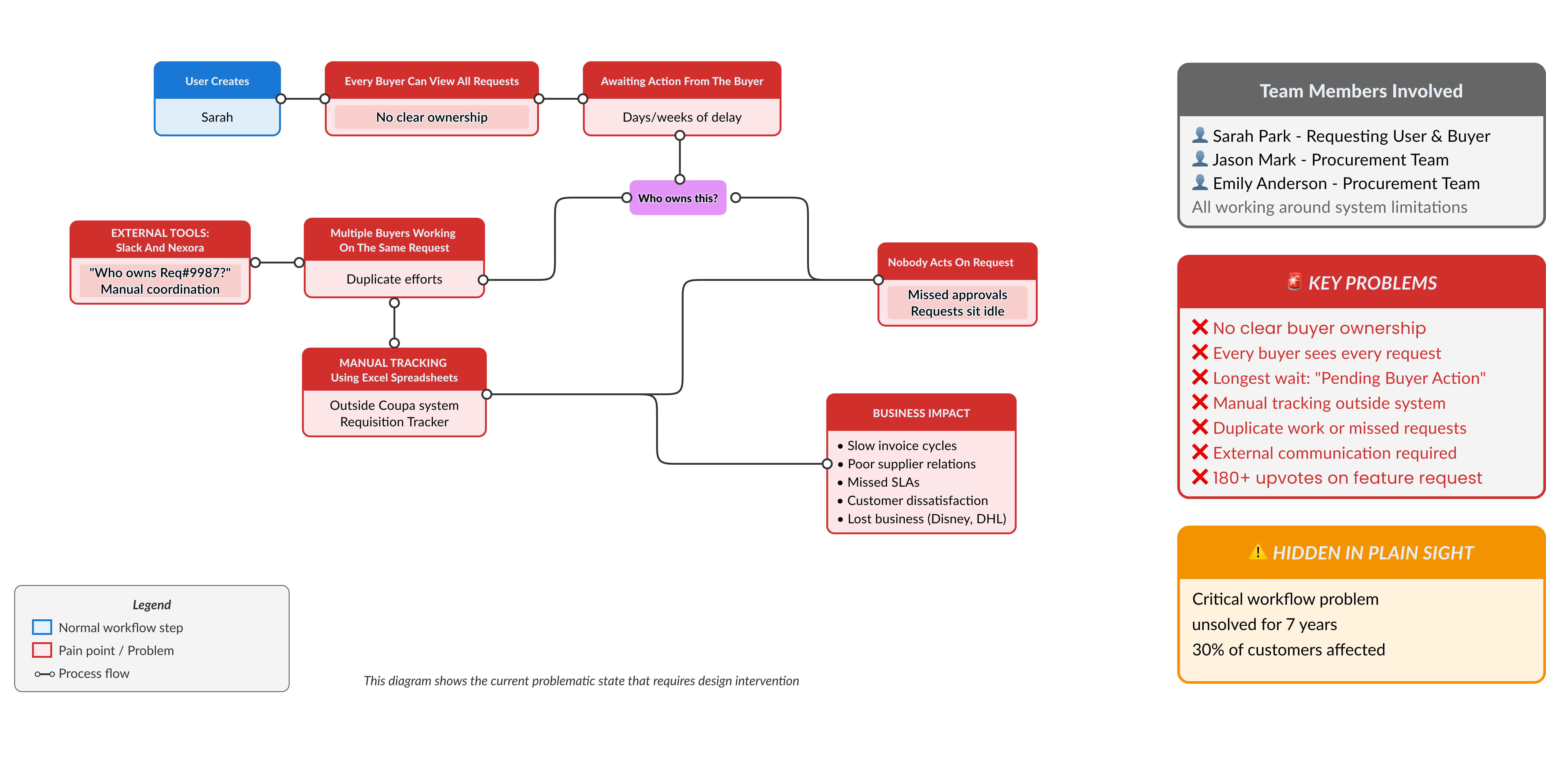
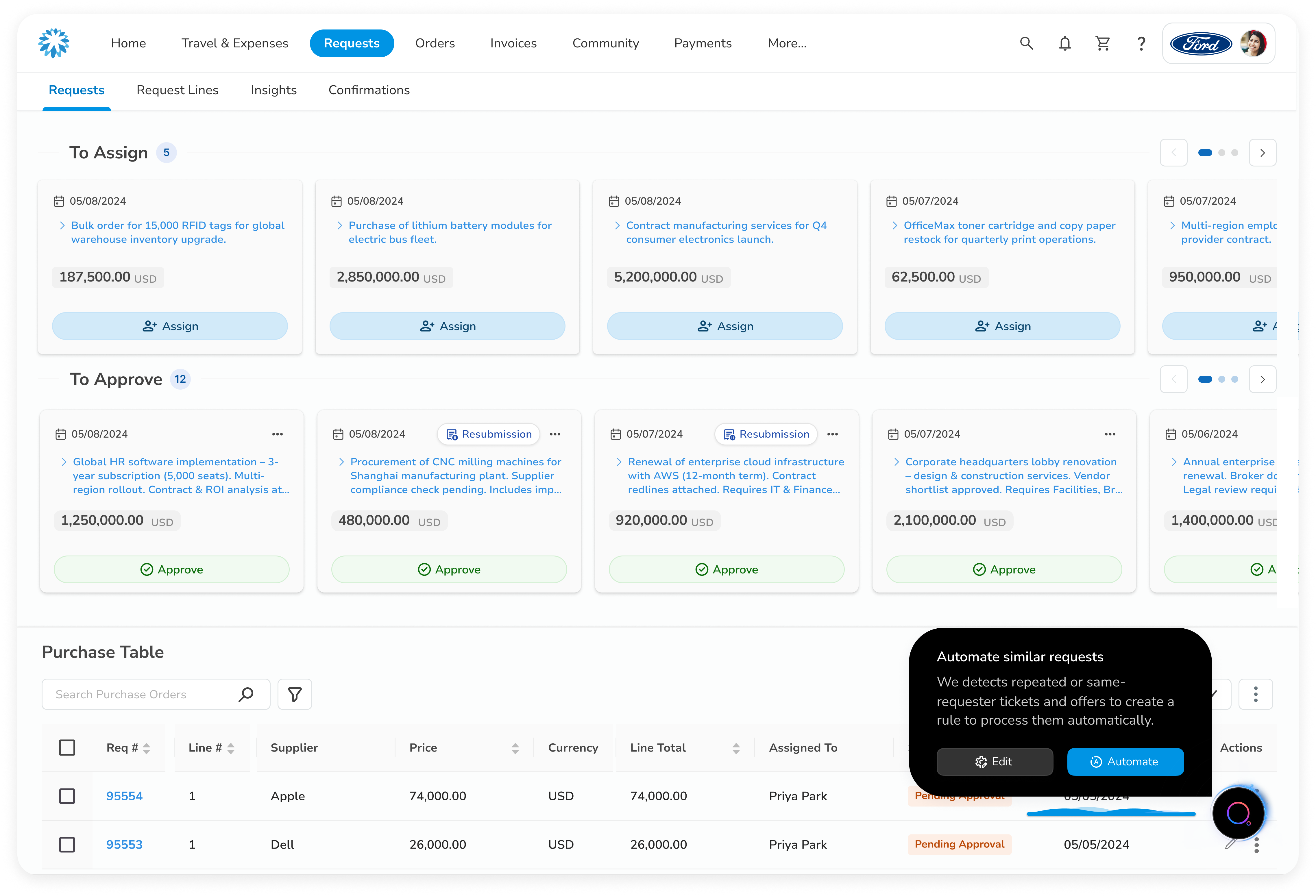
Users like Sarah could create requests, but ownership was unclear, every buyer saw every request, leading to confusion and delays. Buyers often relied on Slack, Nexora, and Excel spreadsheets to manually coordinate assignments, causing duplicate work, idle requests, and even missed approvals.
To solve the ownership issue, our first milestone focused on clarifying who should take action
on each requisition. I worked with PMs, engineers, and the design system team to introduce individual assignment, so each request could be clearly routed to a responsible buyer.
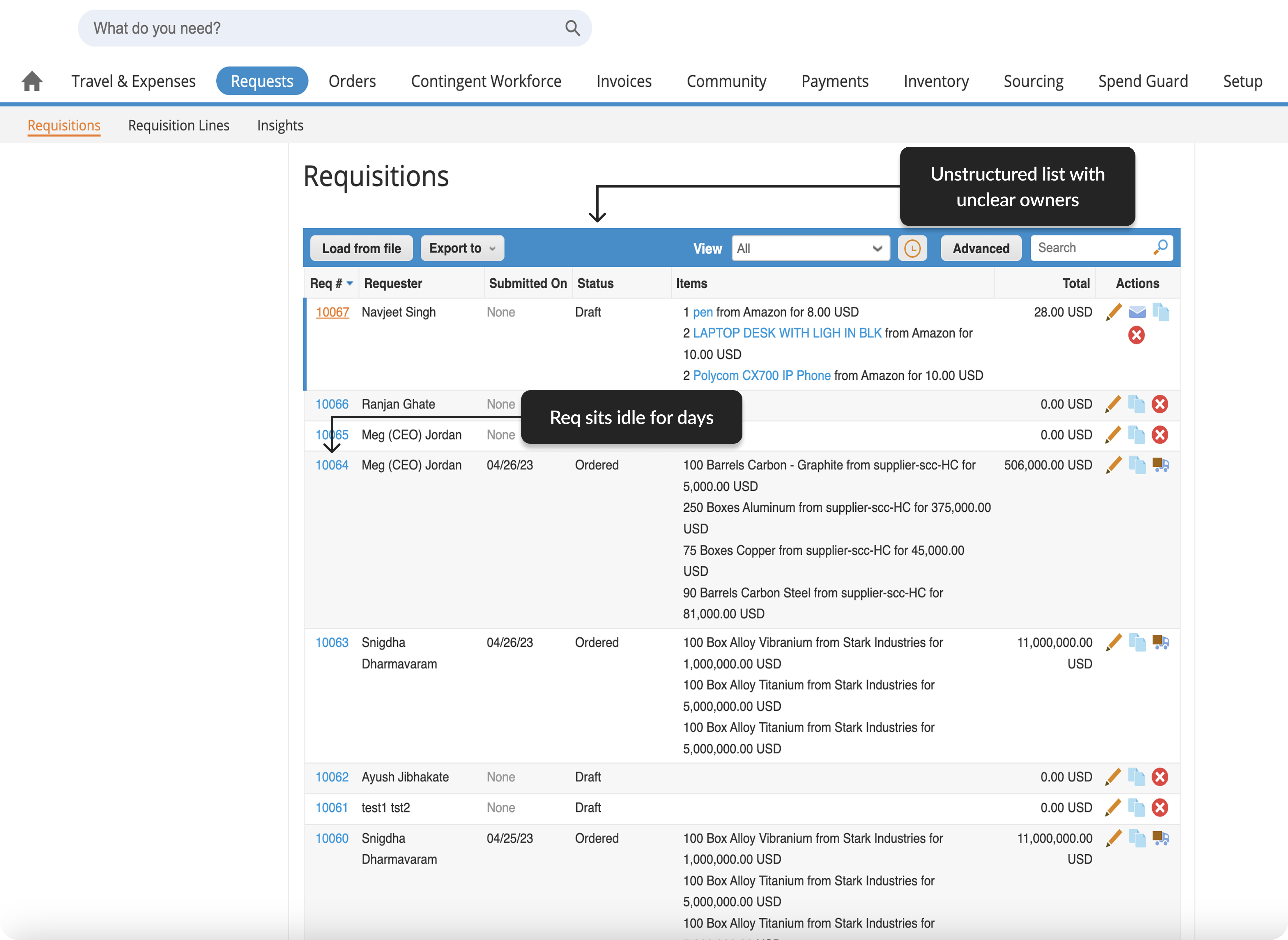
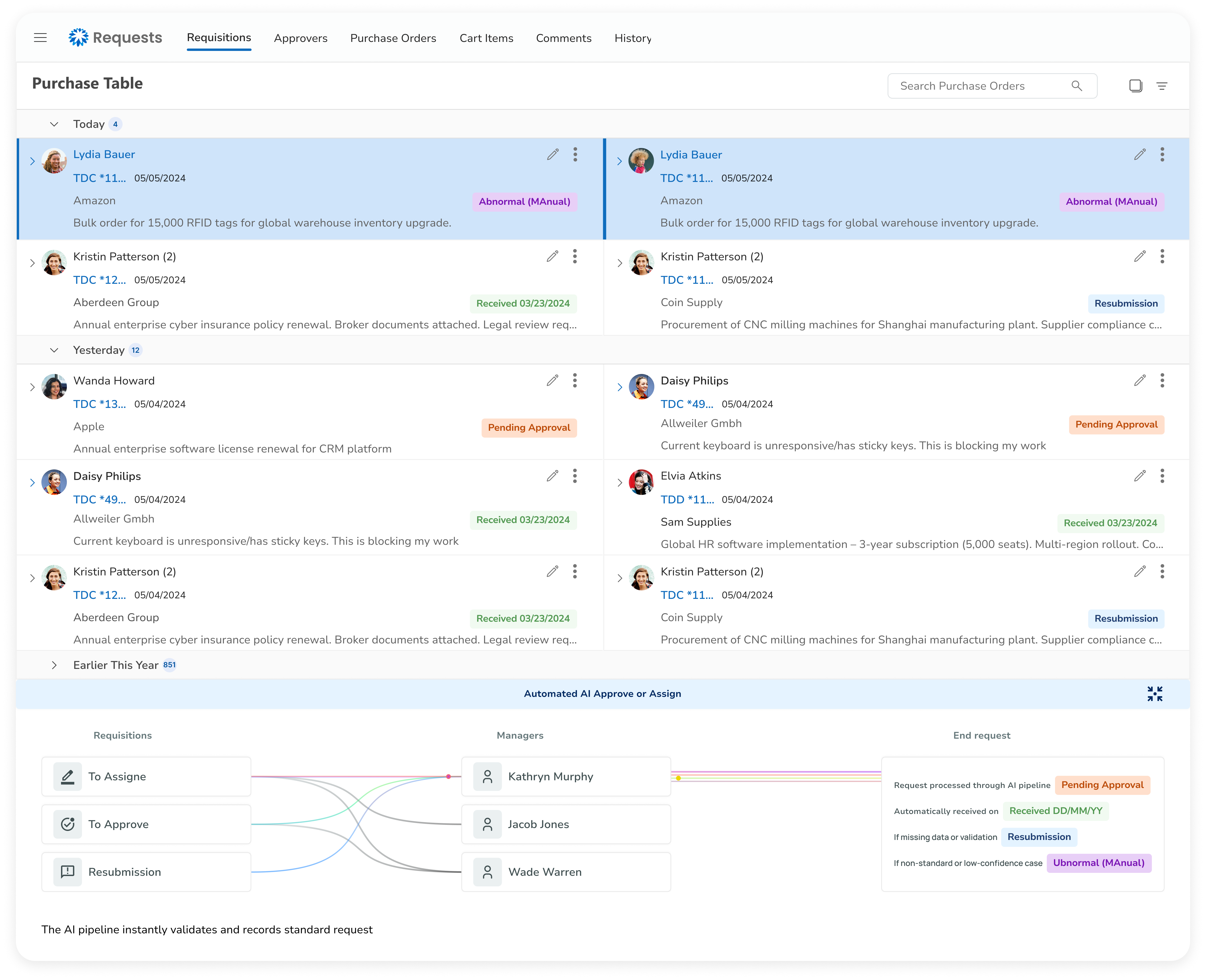
The original requisition page showed all requests in a single unstructured list, with no clear ownership every buyer saw everything, whether it was relevant to them or not.
After:

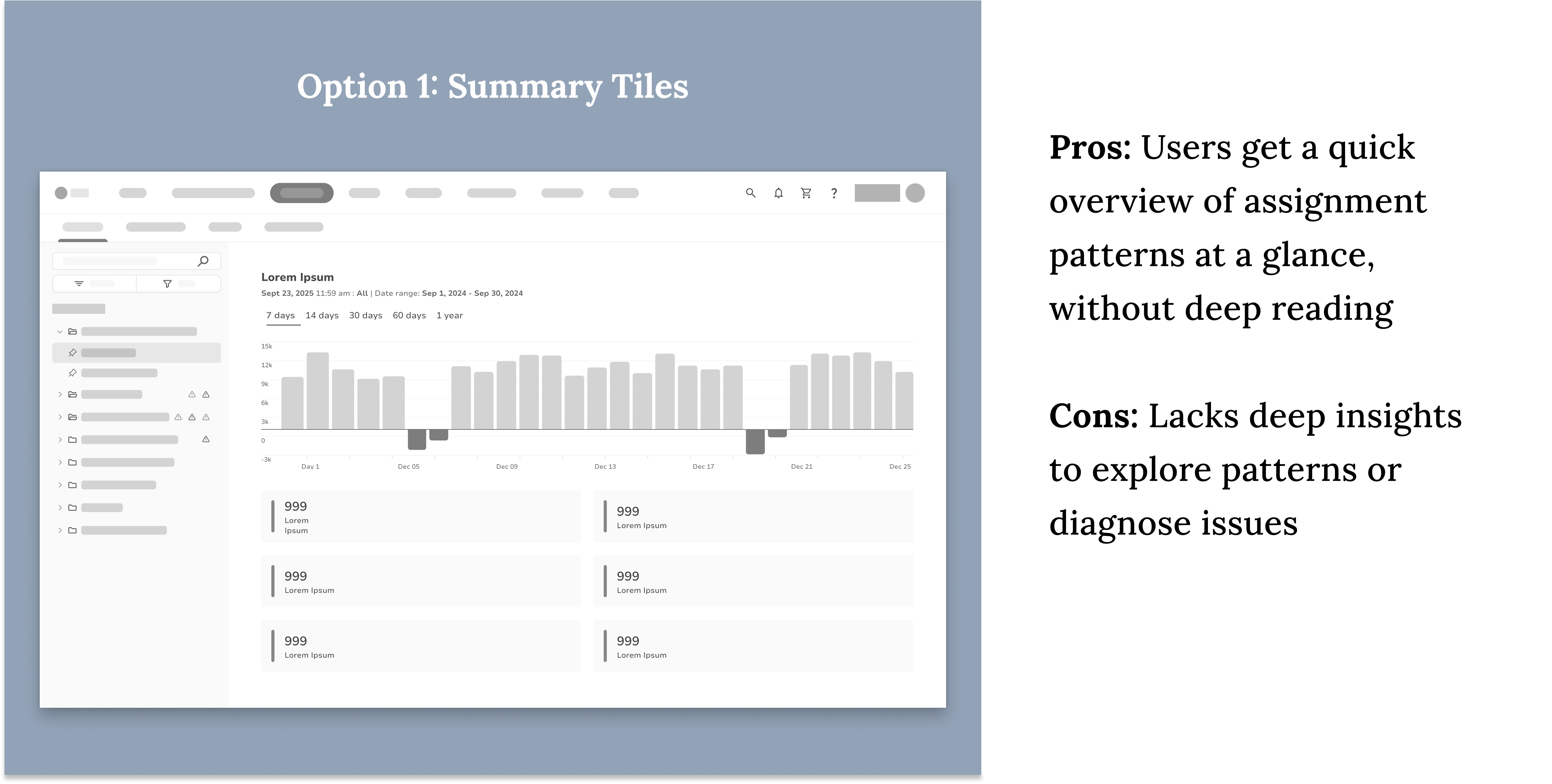
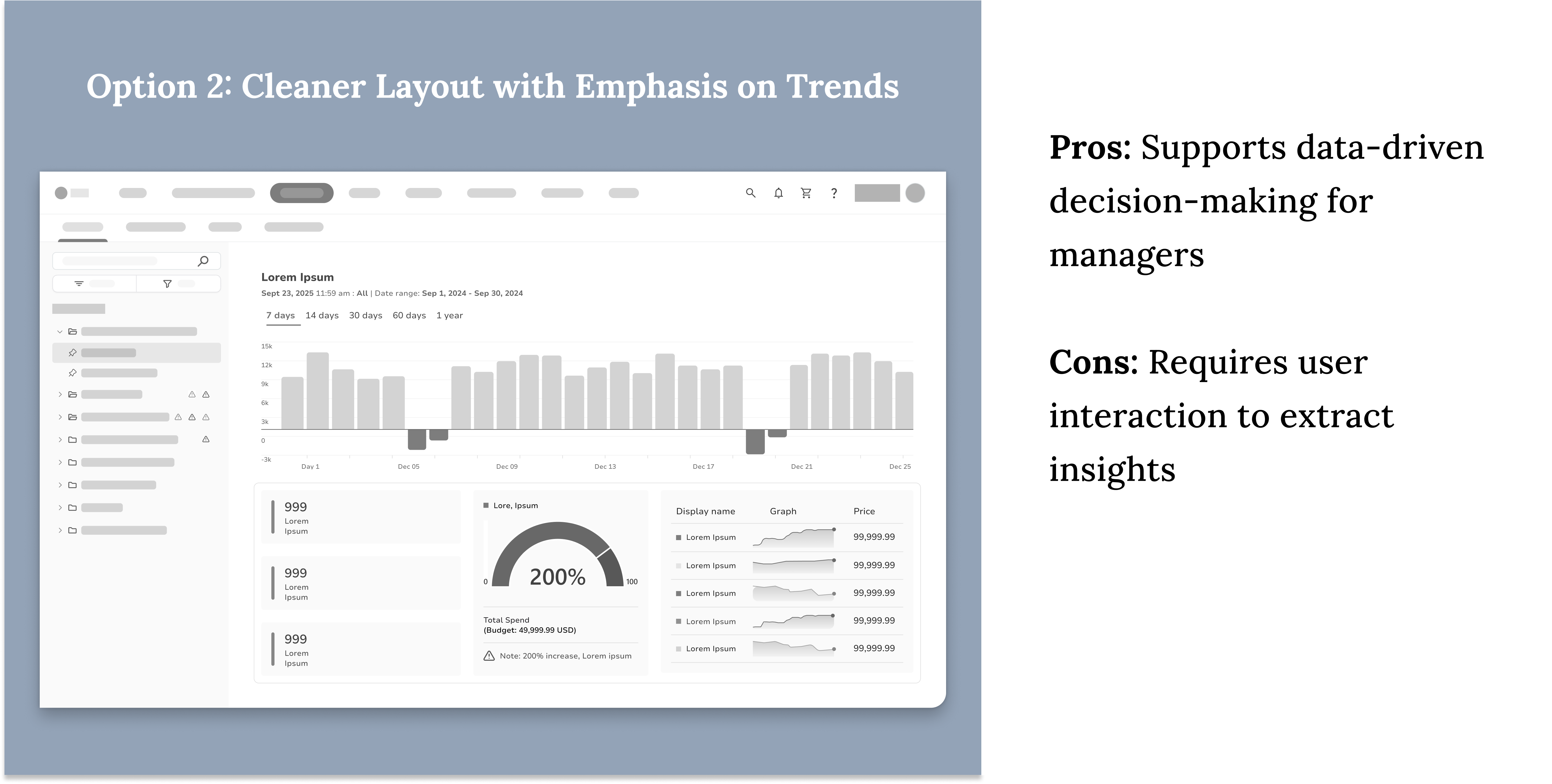
Тhe new version introduces interactive request cards, instant assignment, flexible filtering, and a summary table with key details for faster processing and improved control.
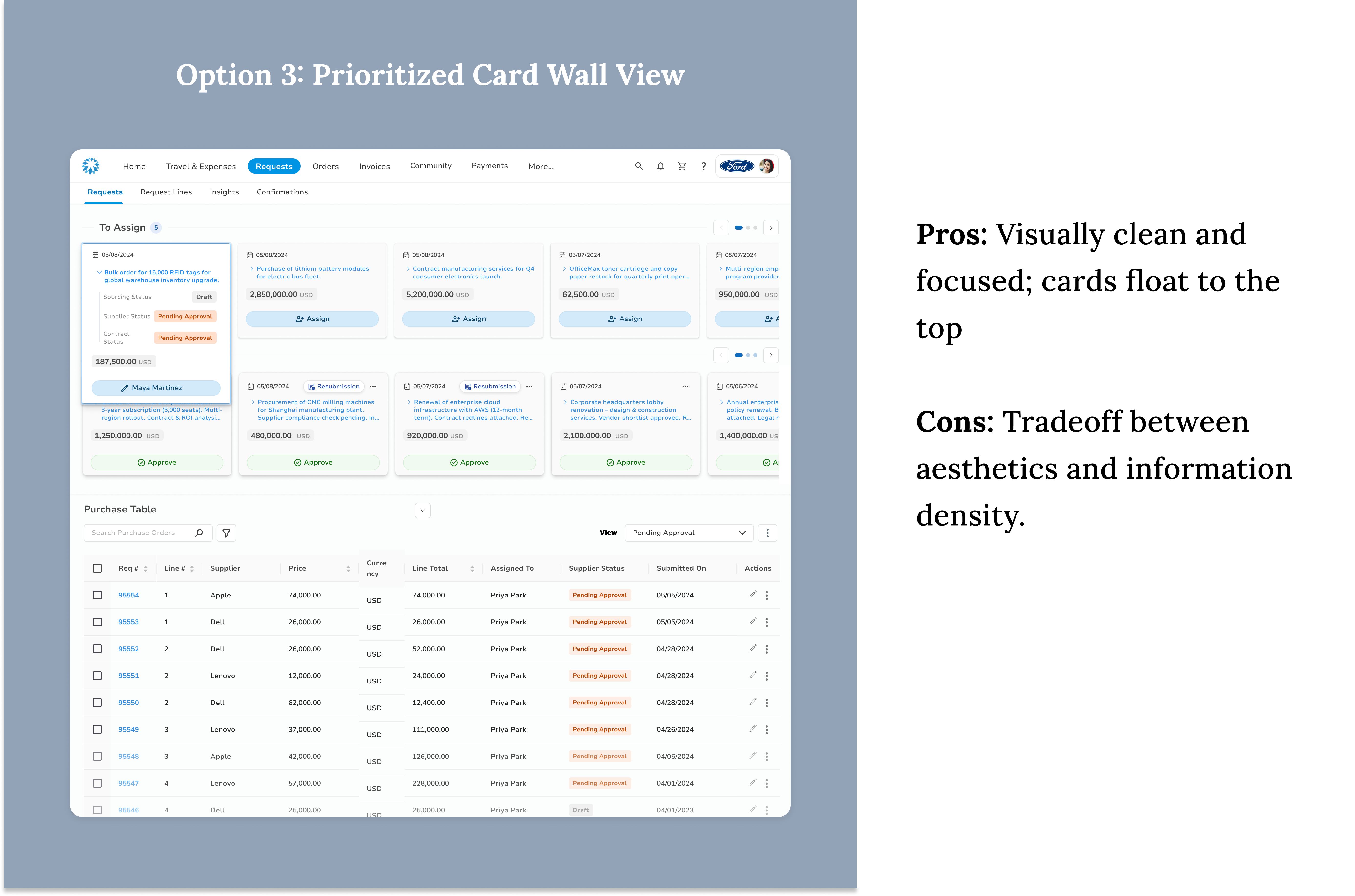
To find the right balance between prioritization, visibility, and usability, I explored three distinct layout directions.

Design System
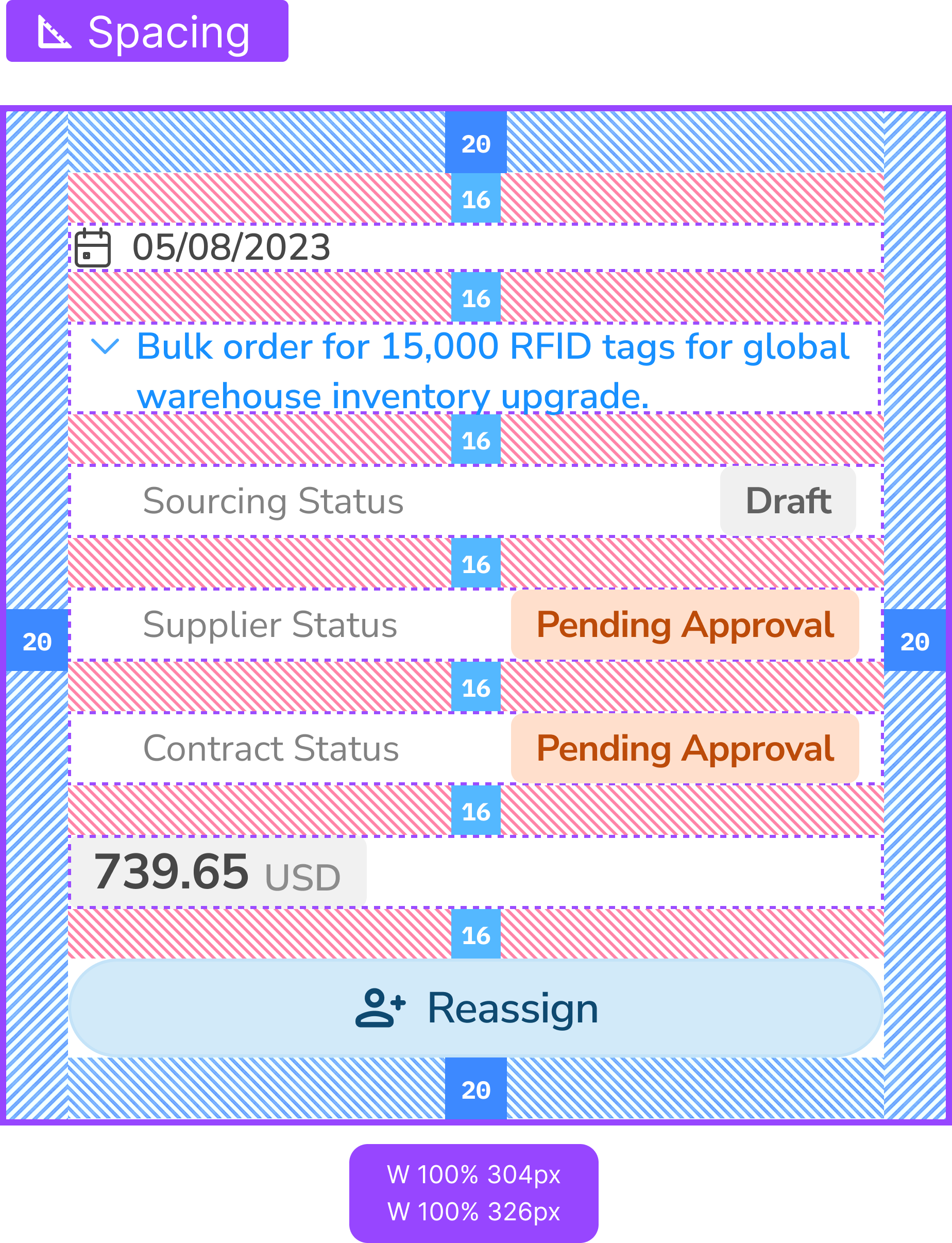
I created a card component that balances clarity and scalability. It standardizes spacing, grouping, and visual hierarchy—making it easier for buyers to scan, take action, and adapt to future system needs.


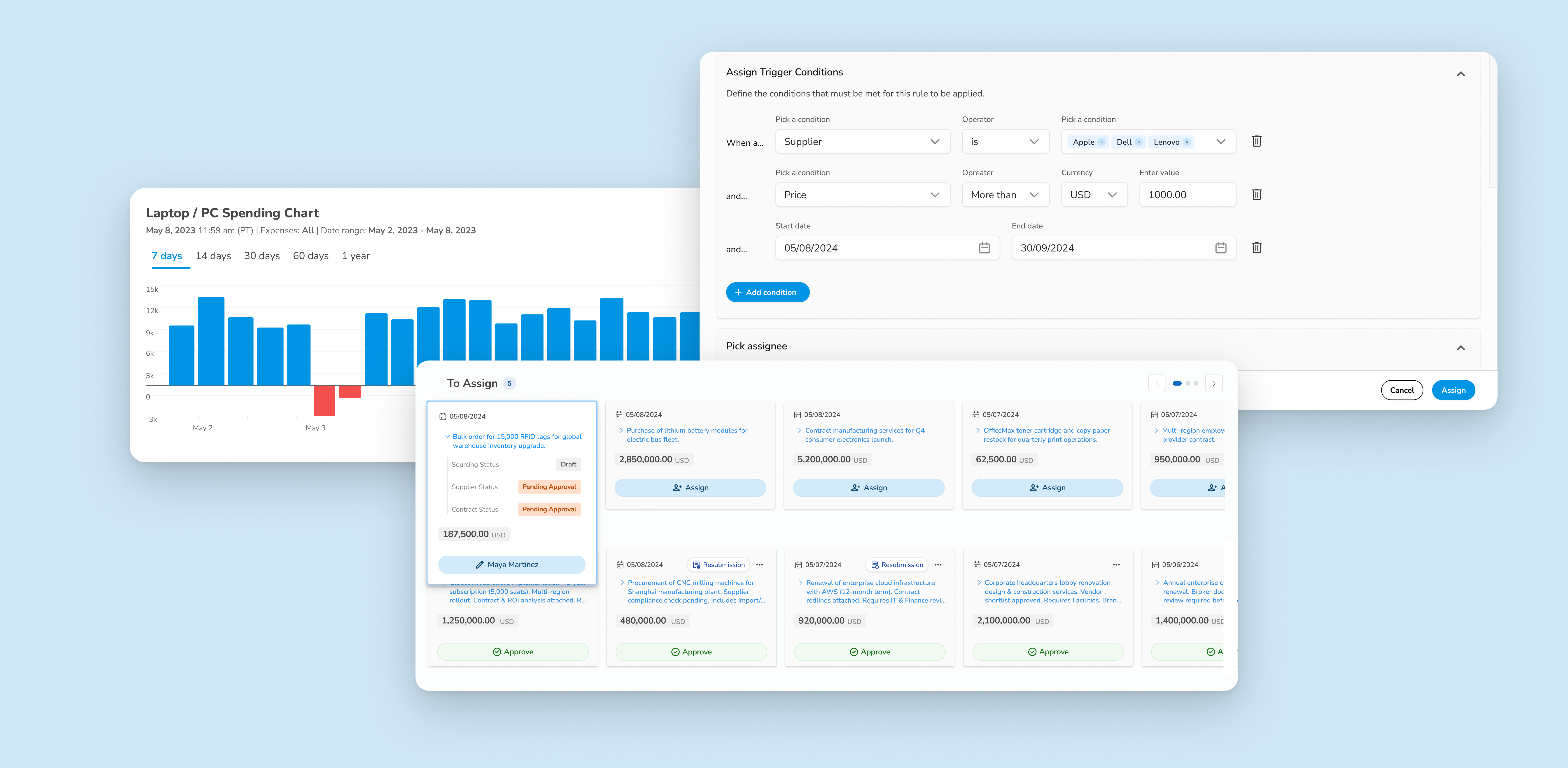
Milestone 1B – Solving Manuel process
To reduce manual effort and speed up request handling, I explored ways to automate the assignment process based on predefined business rules.
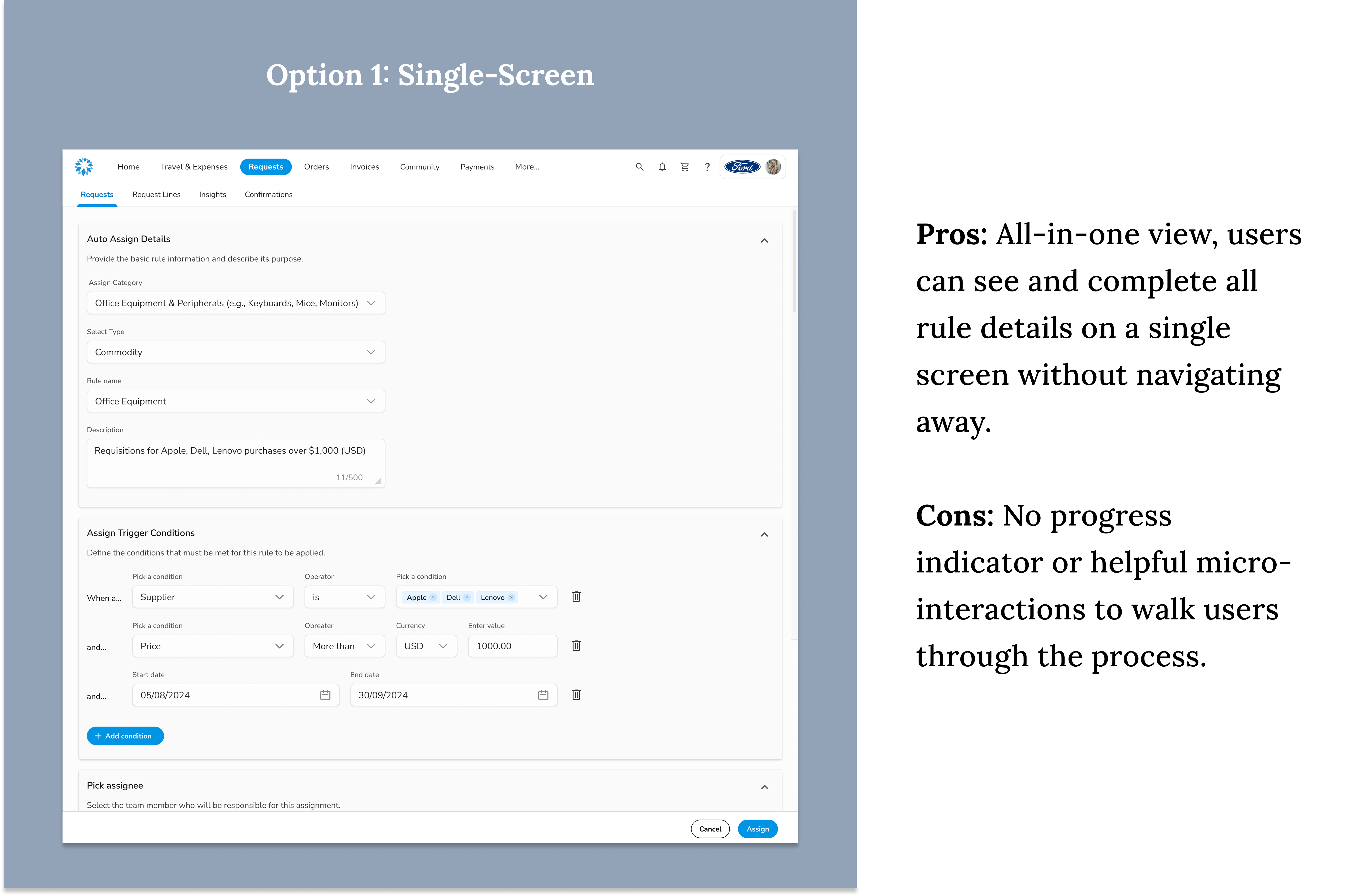

After testing both options, we moved forward with the Single-Screen layout as our final design. It proved most effective for our power users, allowing them to view and complete all rule details in one place—minimizing clicks and making it easier to cross-check inputs. To enhance clarity, we introduced inline validations and collapsible sections, improving focus and flexibility without overwhelming the screen.
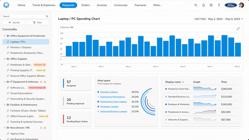
For milestone 2, we focused on improving visibility for procurement managers. These users are responsible for overseeing high volumes of requisitions, managing team capacity, and ensuring timely approvals. However, they often lacked a clear view into workload distribution or potential bottlenecks
Milestone 3 – Team onboarding & feature adoption
Next, I wanted to launch this feature with onboarding to help companies start using it.
So instead of passive tooltips or modals, I designed a lightweight product tour, embedded right in the workflow.It helps admins take real actions, like assigning requests or setting up automation, right when they need it.The goal was to make adoption feel seamless and useful, not like training.
Design System
I collaborated closely with the design system team to enhance our component library, not just to maintain visual consistency, but to ensure it was responsive, modular, and easy to scale. As new card patterns emerged from the assignment project, we updated foundational elements like colors, input fields, buttons, and grid spacing to support reuse across different Coupa products and teams.
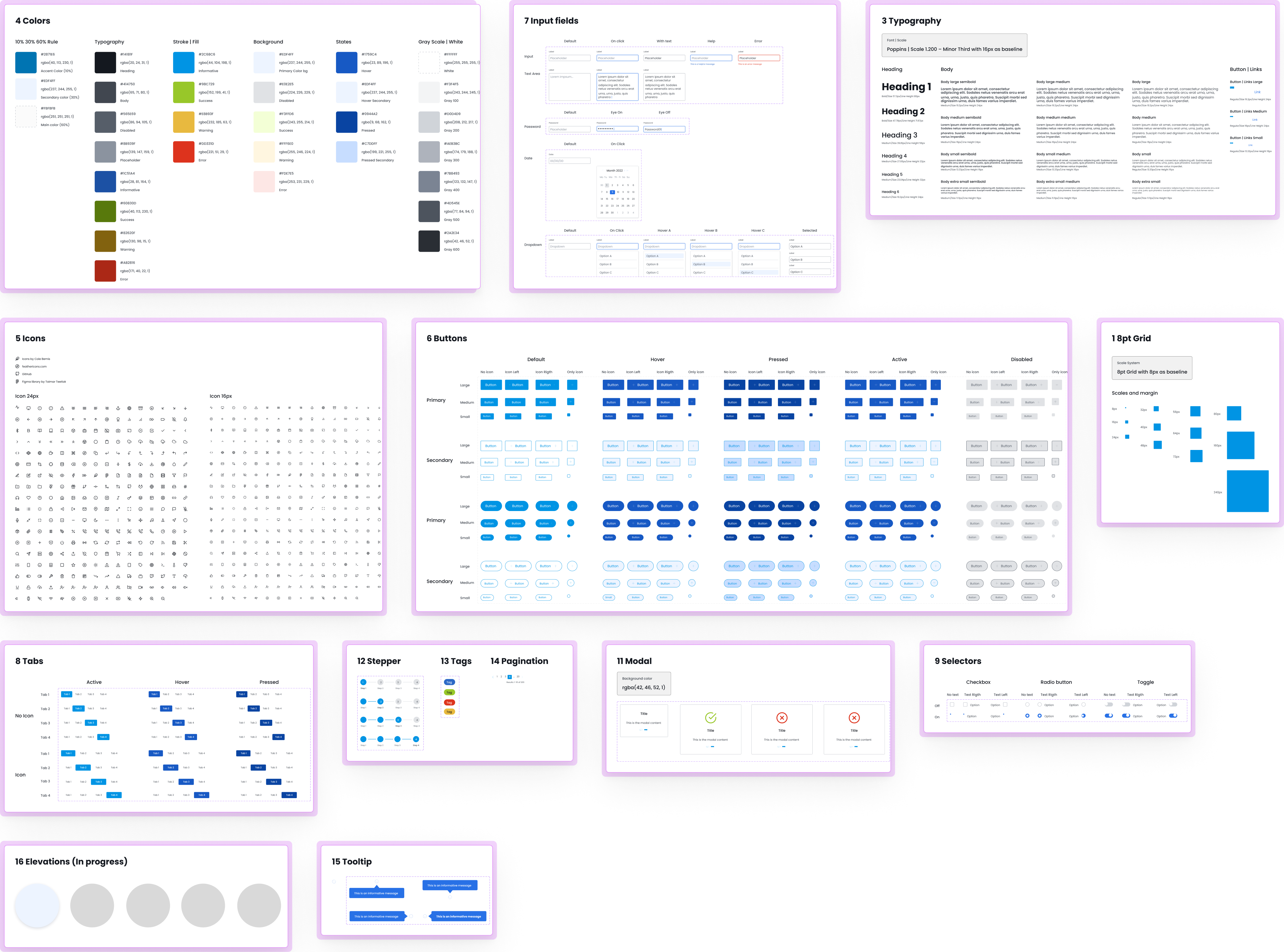
+14 additional components (not shown here)
And looking ahead, the long-term vision is to automate even more of this workflow using Coupa’s AI pipeline. The idea is that instead of relying on users to create manual rules, the system will learn from past actions and automatically triage and assign requests, whether they need approval, reassignment, or extra review.